

M!X restaurant
Restaurant branding and creation with Shift Up
For the summer of 2018 I got the opportunity to intern at Shift Up, a design firm in Seattle. With this firm, I was able to expand my knowledge of the Adobe softwares and learn what it was like to work with all different types of clients. What I really enjoyed about this experience was that I was able to work on multiple projects and see how the design process worked within this organization.
Menu Design
The mission
M!x is a fun, healthy, and colorful restaurant. It is an easy on-the-go restaurant that encourages a healthy lifestyle.
The Challenge
Design the layout of the menu, create different ideas and variations for business cards, design posters for the actual on-site restaurant, and come up with creative ideas for the overall brand.
The Solution
A menu and assets that represent the restaurant’s colorful and fun design aesthetic. Images will be used to show the food so that the menu is easily accessible to everyone at first glance.
The Processs
Since the overall brand look had already been created, it was exciting to be able to follow their brand guidelines and add my own colorful touches.
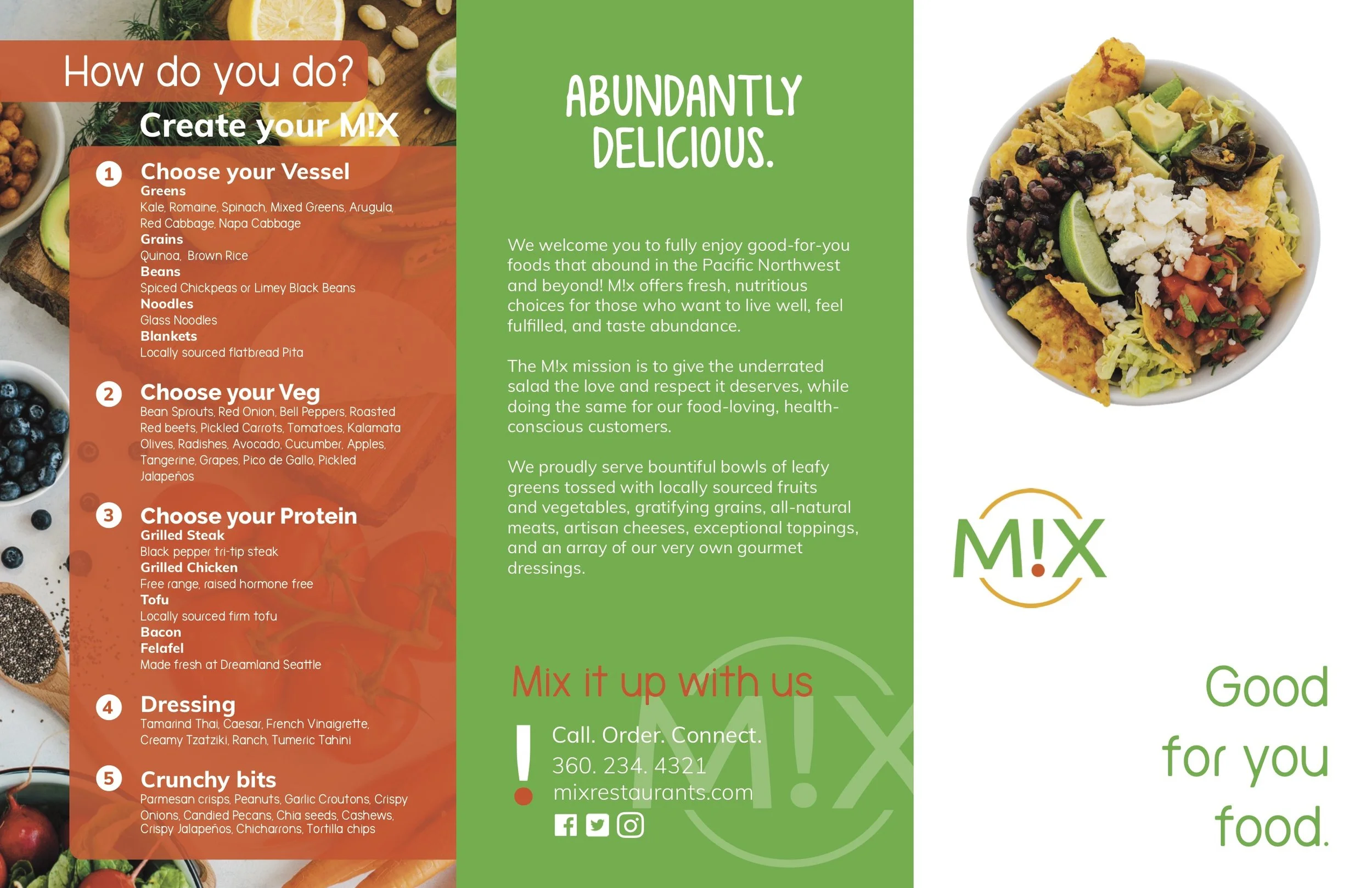
*Back of the M!X menu
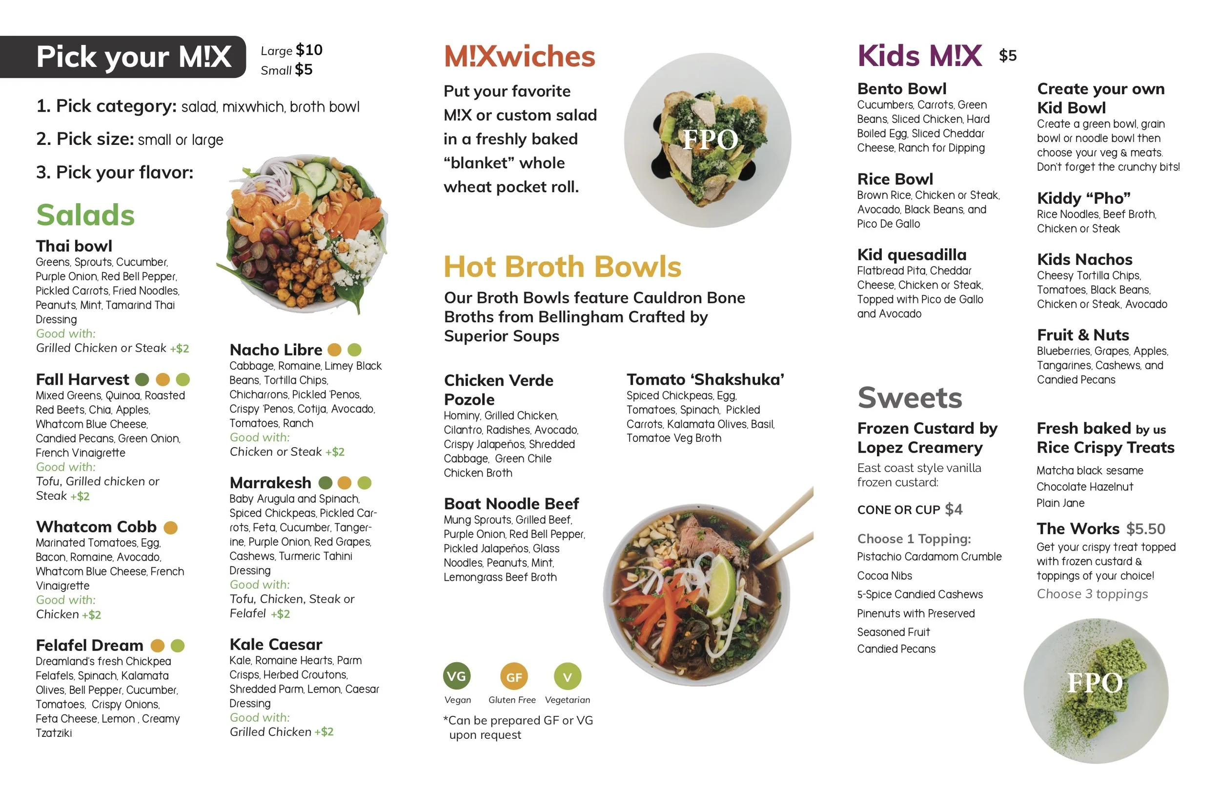
*Inside of the M!X menu
You can check out any menu changes at M!X.com
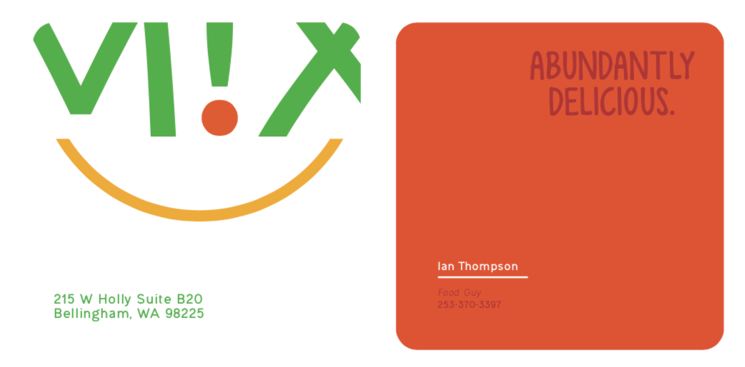
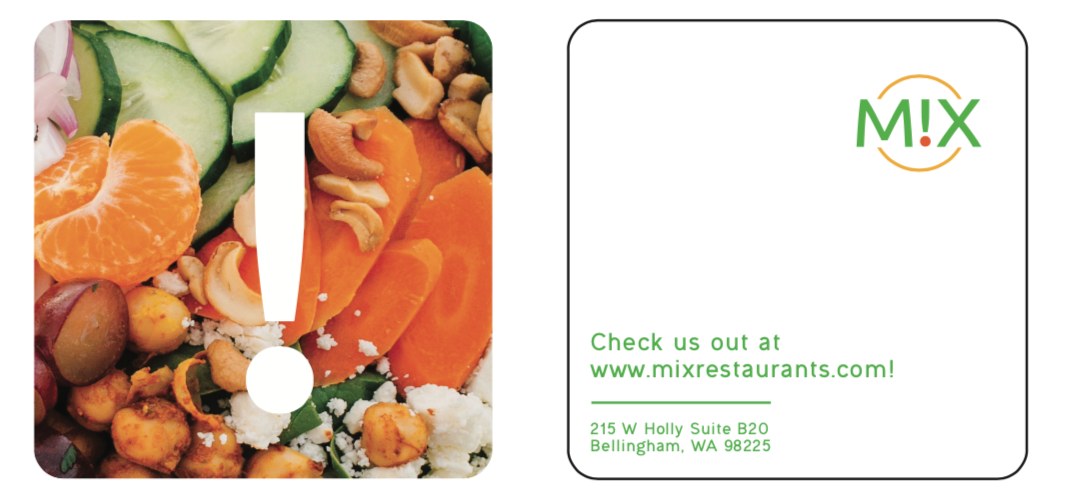
The business cards:
The design team was interested in having business cards that had the rounded corners. It gave the colorful images and logo a sleeker and cleaner look than a more traditional business card would have. I made many different iterations of business cards that included a lot of the food that the restaurant offers. I came up with the idea to use the exclamation point as a kind of a secondary logo that maybe the business could use when they became more identifiable. My director decided to use this idea of the exclamation point to be a stand that would hold the menus at the restaurant locations.